EQUIS
2025
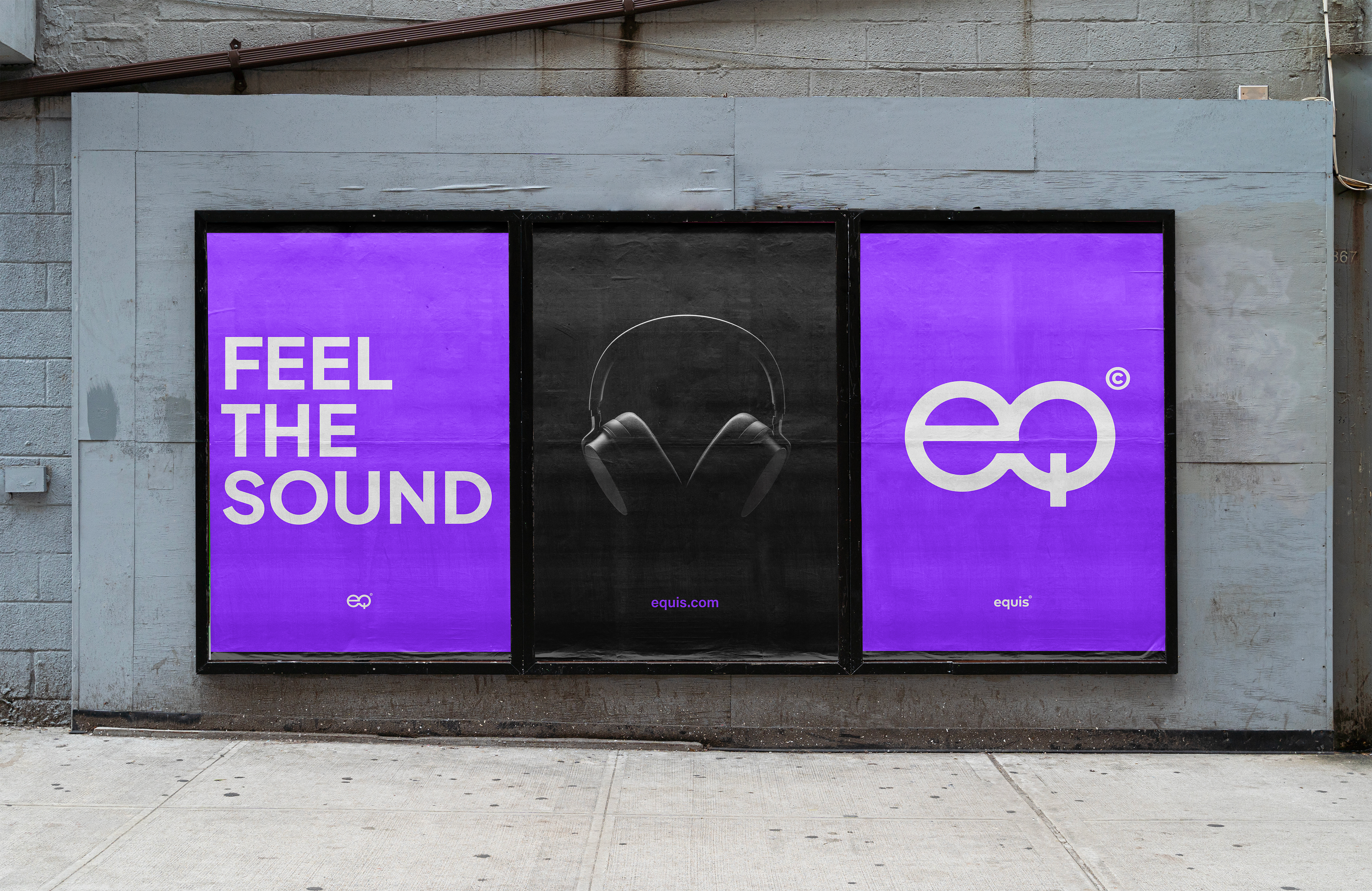
Visual Identity for a Consumer Audio Brand
Simple, electric, and bold—just like the brand itself. Equis is a new audio manufacturer, based
in China, specializes in high-quality headphones, with a strong focus on modern aesthetics
and performance.
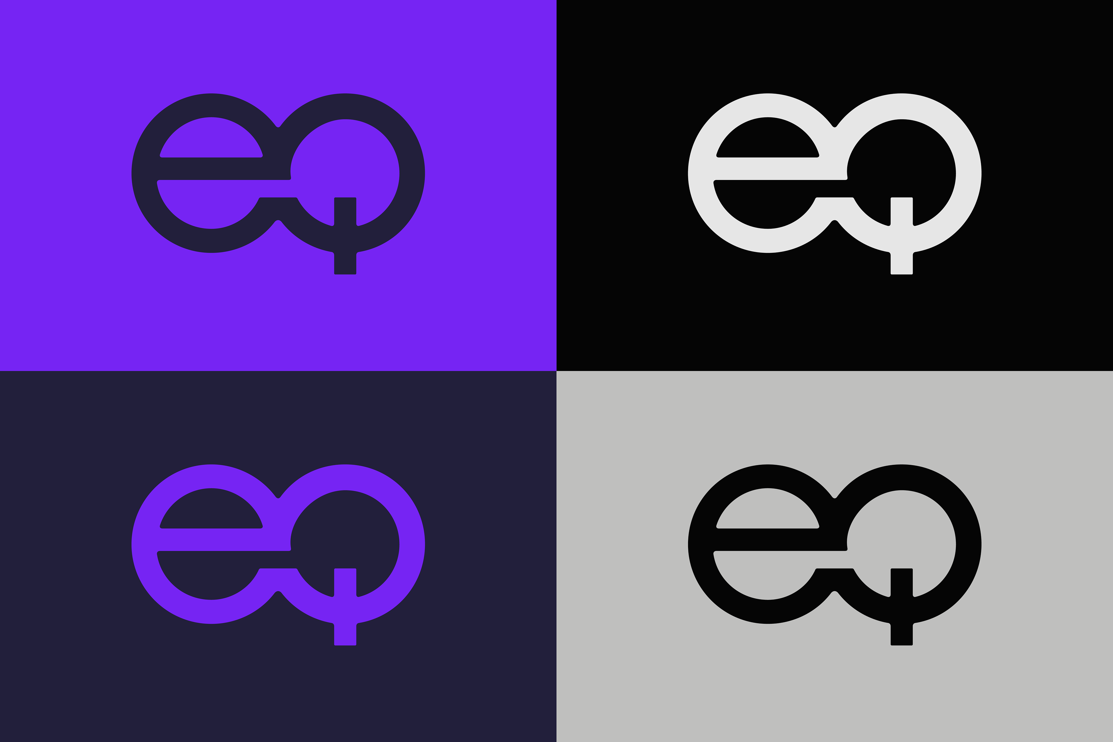
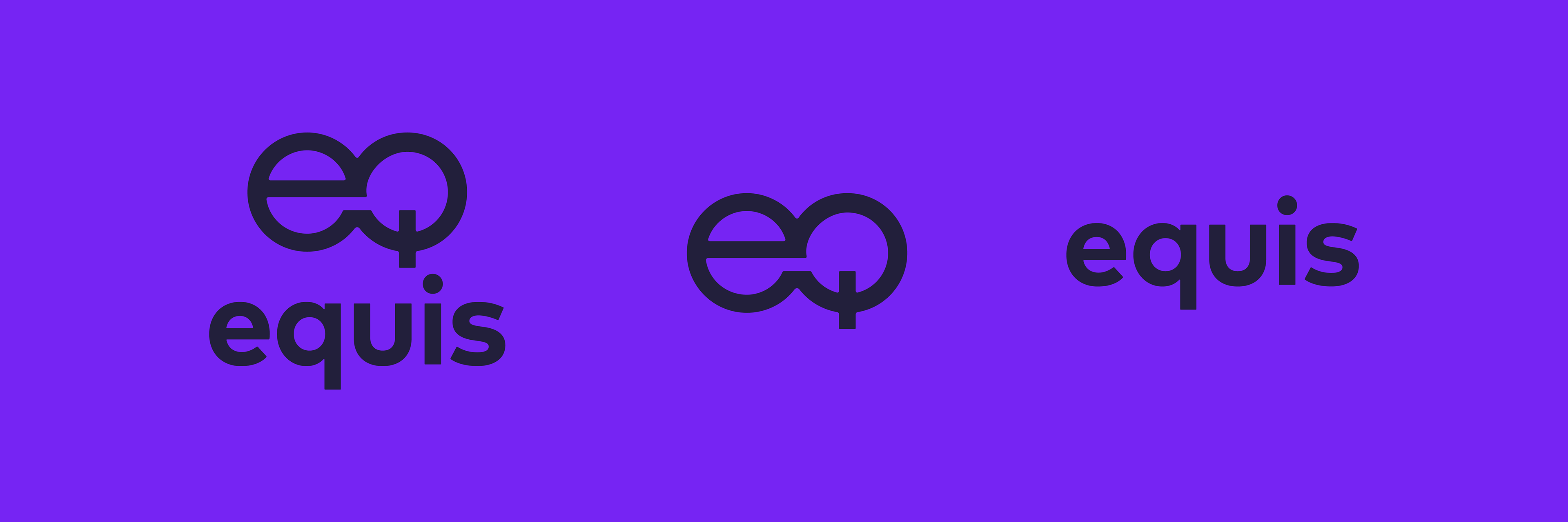
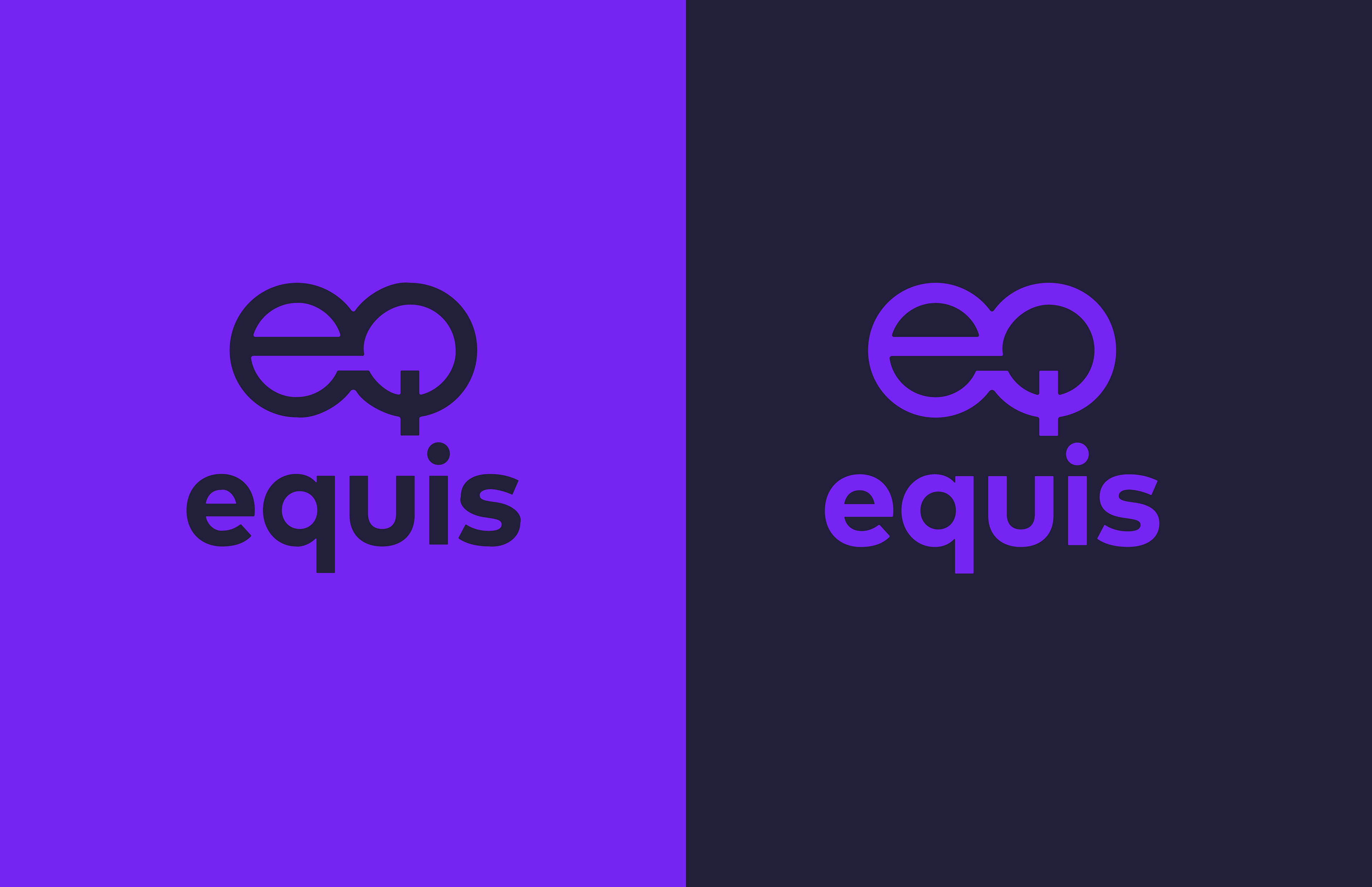
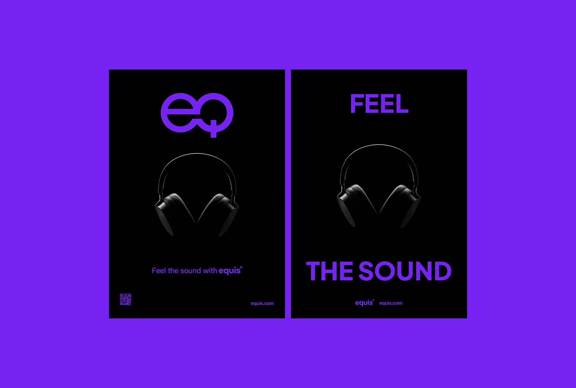
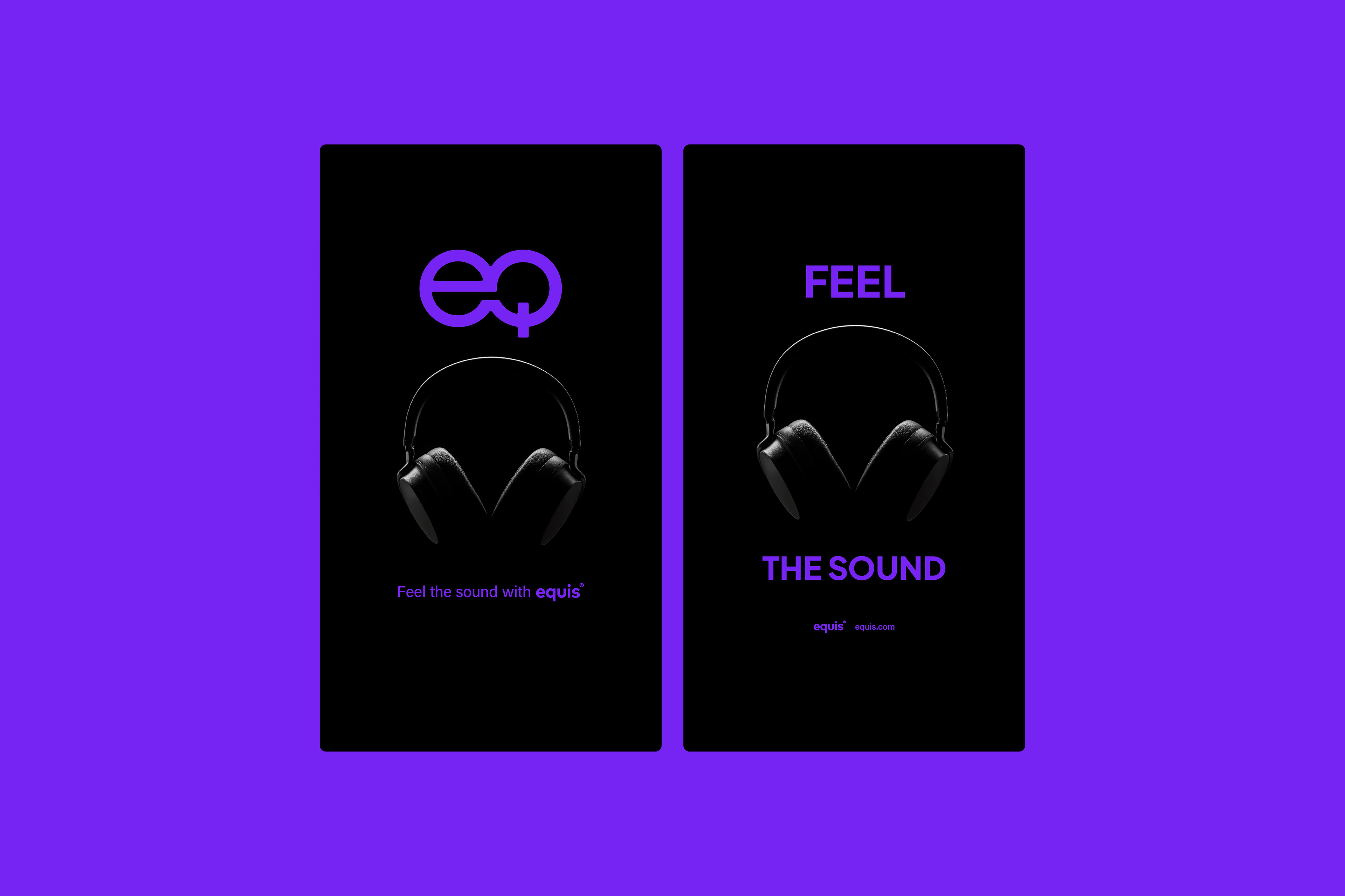
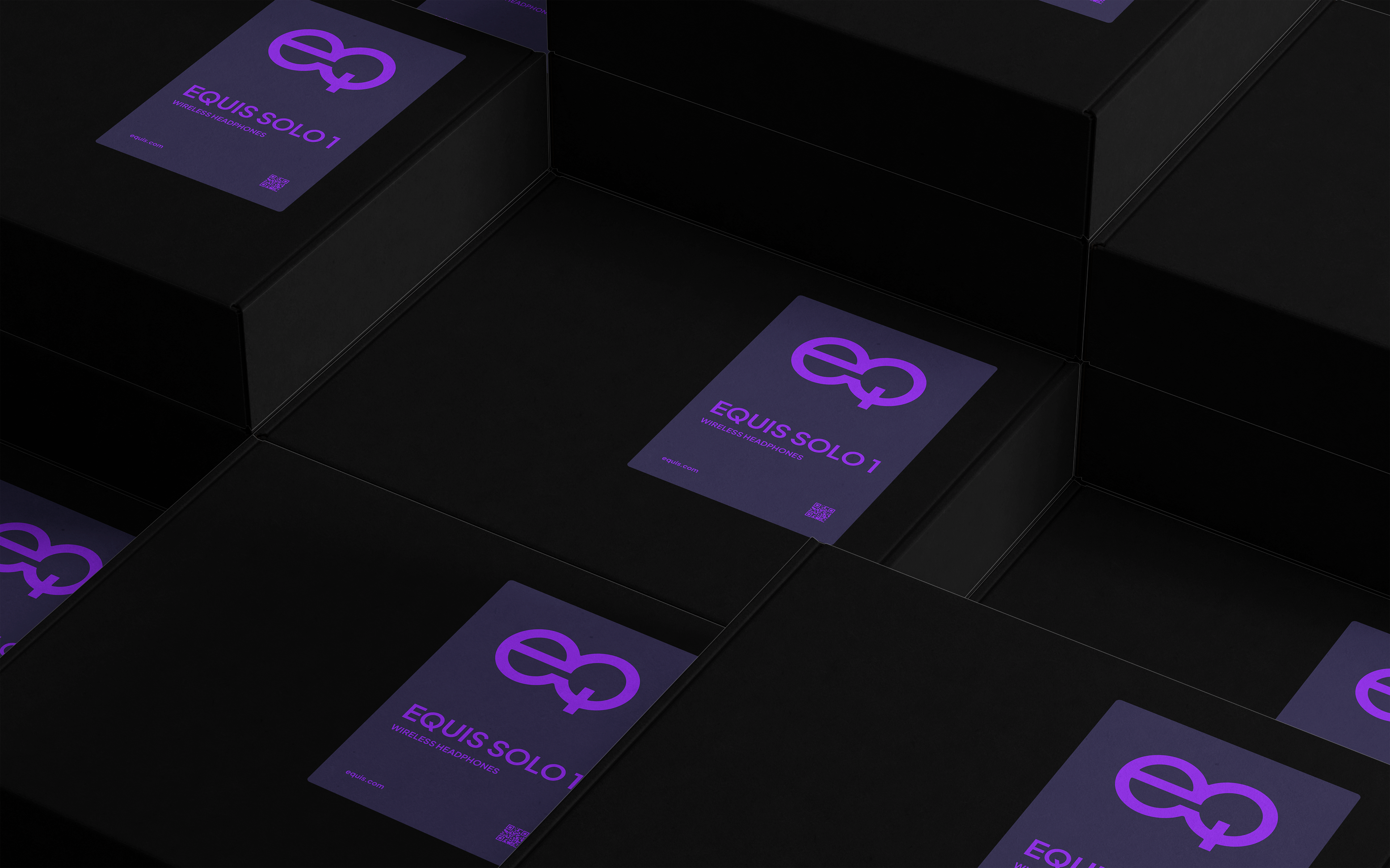
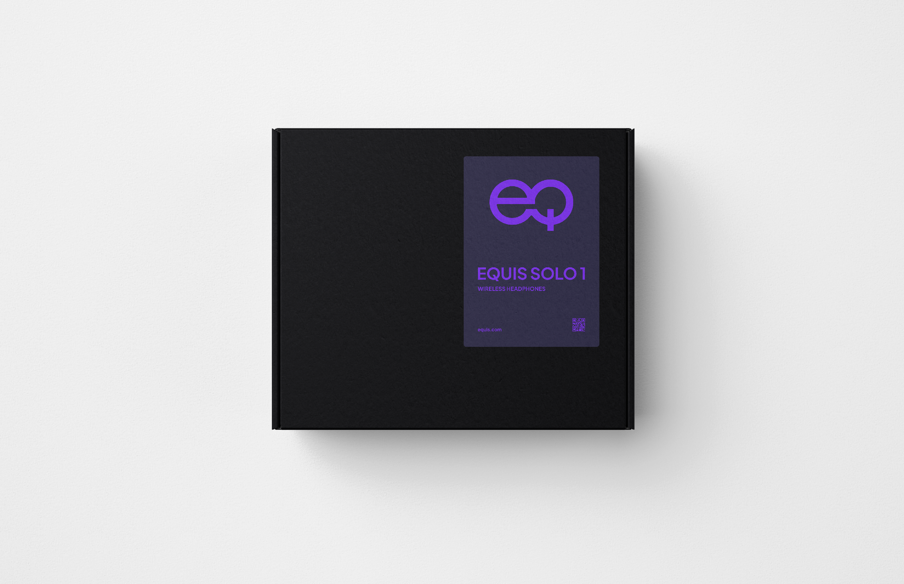
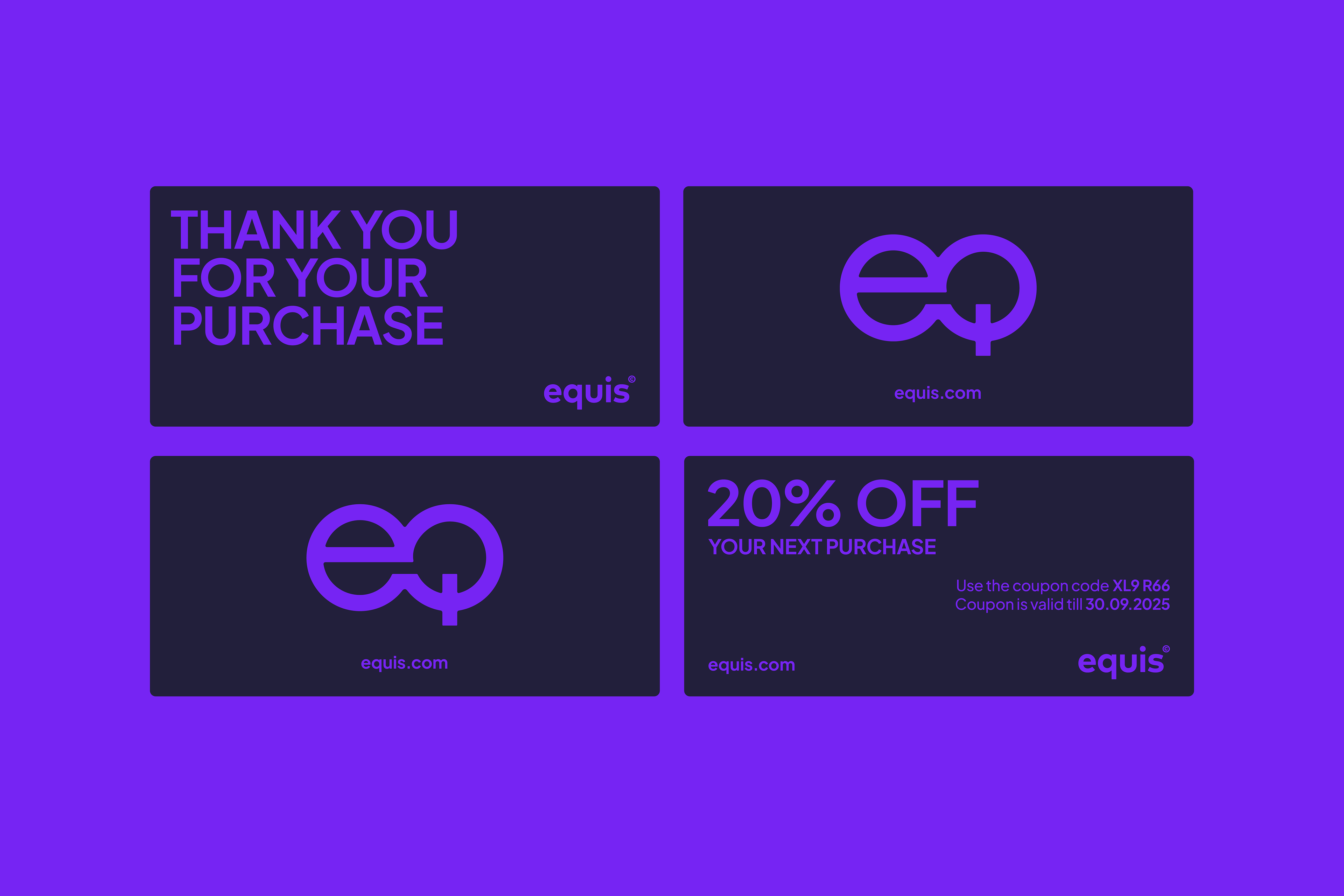
At the core of the brand’s identity is a distinct Symbol, designed to be featured prominently on the products. Derived from simple geometric forms—two circles—it creates a recognisable mark.
The custom Wordmark, equis, is inspired by sans-serif geometric typefaces, blending clean, structured design with a touch of humanist warmth. Its accessible letterforms ensure legibility even at small sizes, while ultra-bold strokes and rounded corners echo the visual language of the brand Symbol, maintaining a balanced and cohesive identity.